THE START
Foerstel Piper Martin was a full-service agency built on health food packaging, though the work rarely stayed in one lane. I started here in February 2017, as an intern and a full-time student. By 2019, I was formally an Art Director. What happened in between is the real story.
THE TRIAL
Six months into my internship, the agency's Art Director left suddenly. There wasn't a bench deep enough to absorb his workload. The Senior AD already had a full plate. So did the Creative Director. I was the only capacity left in the building, and the client commitments — scopes, timelines, deliverables — didn't move just because the org chart had.
I wasn't the most talented designer in the room. I was the fastest learner. Within months I went from building out brand guideline documents to concepting for seven-figure accounts, working shoulder to shoulder with the Senior AD and CD to figure it out in real time. I graduated college in May 2018 already doing the job. The title just caught up a year later.
THE BOVINE COLOSTRUM
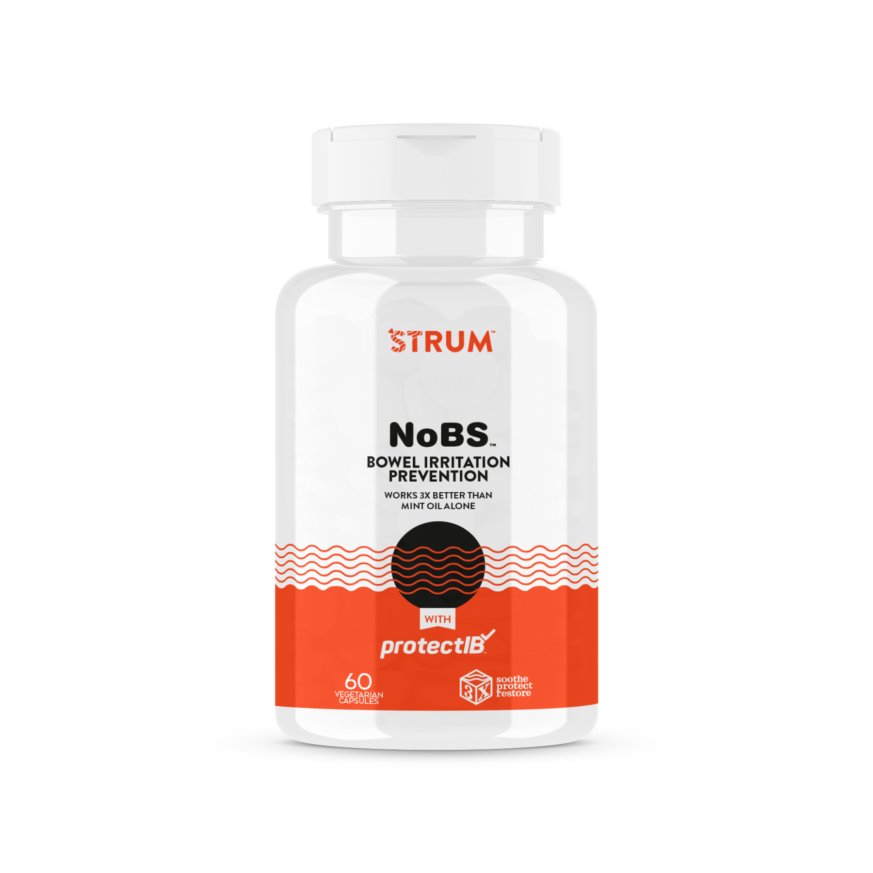
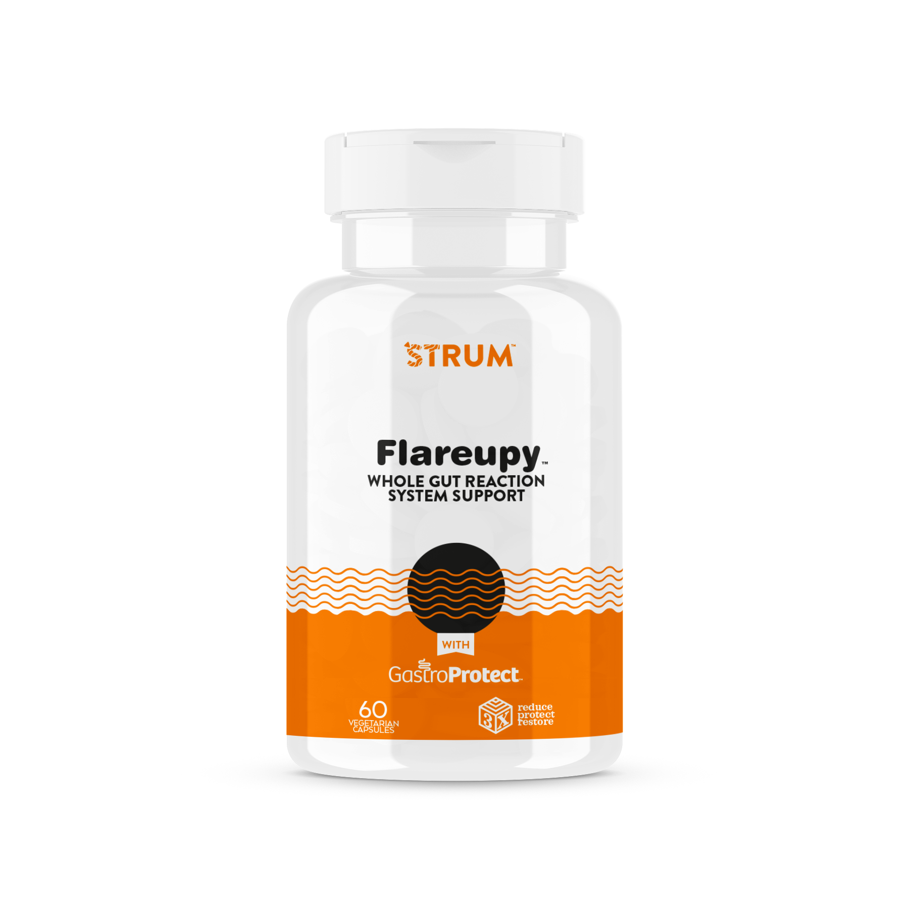
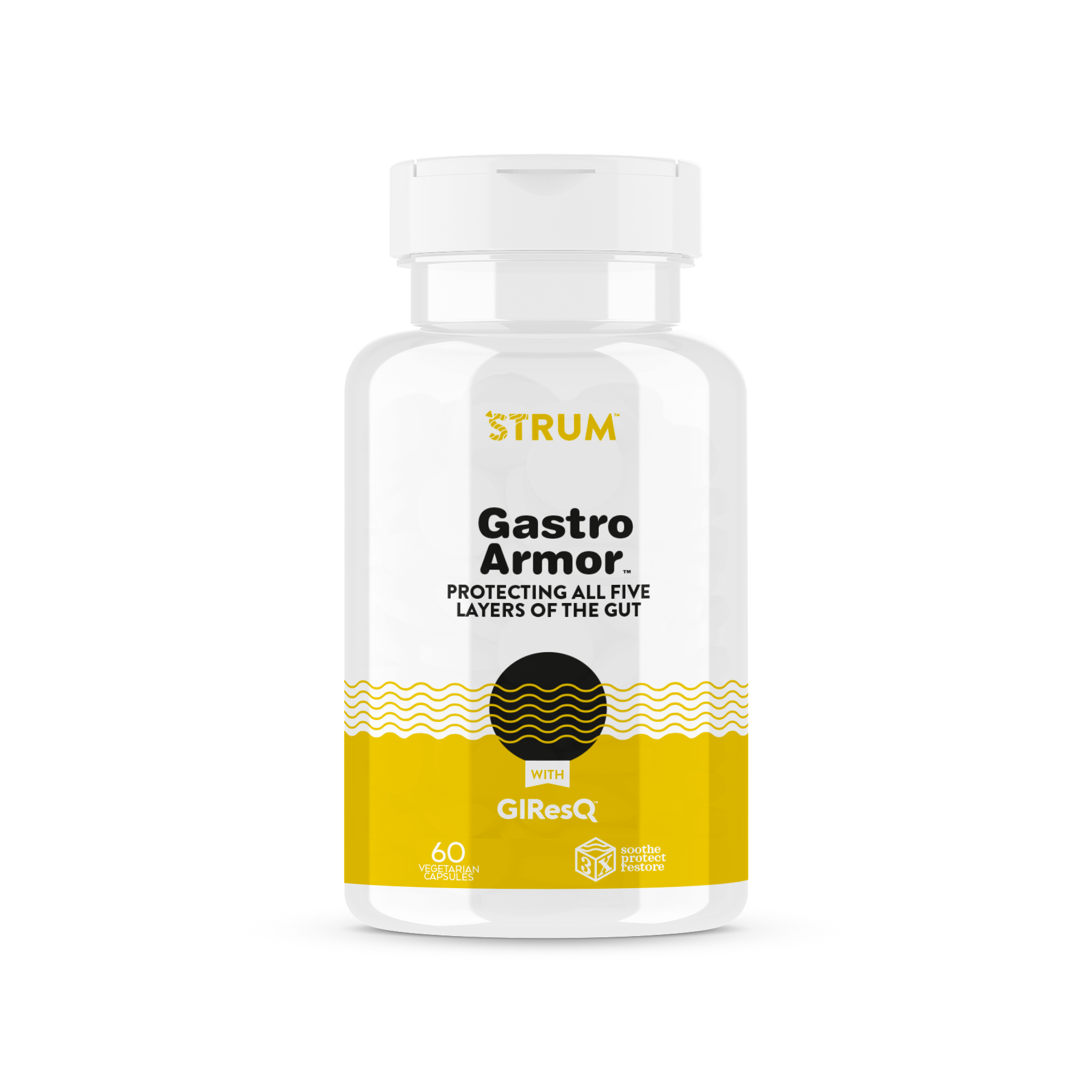
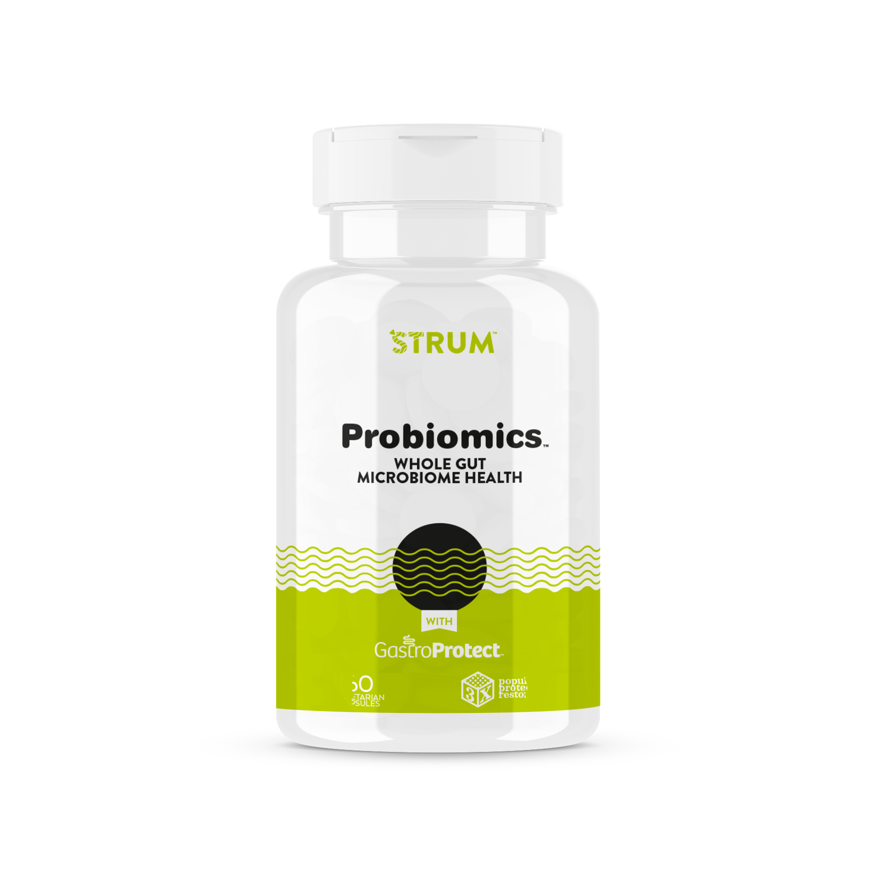
Bovine colostrum is not an easy sell. It's not a category anyone walks into a store excited about, and the brief was blunt: make it feel fun, premium, and exciting enough to earn shelf space at Target circa 2018, without losing the credibility of an actual supplement.
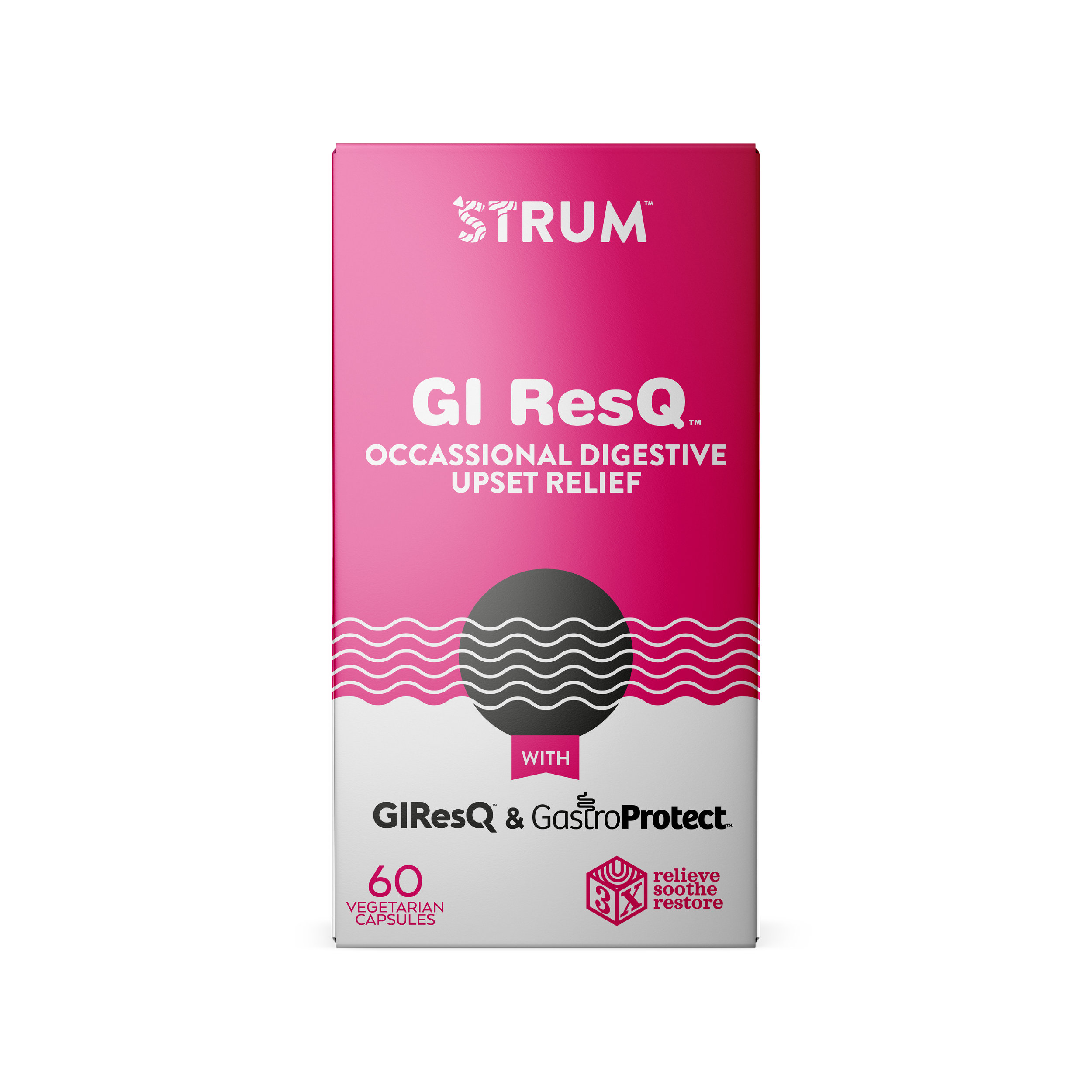
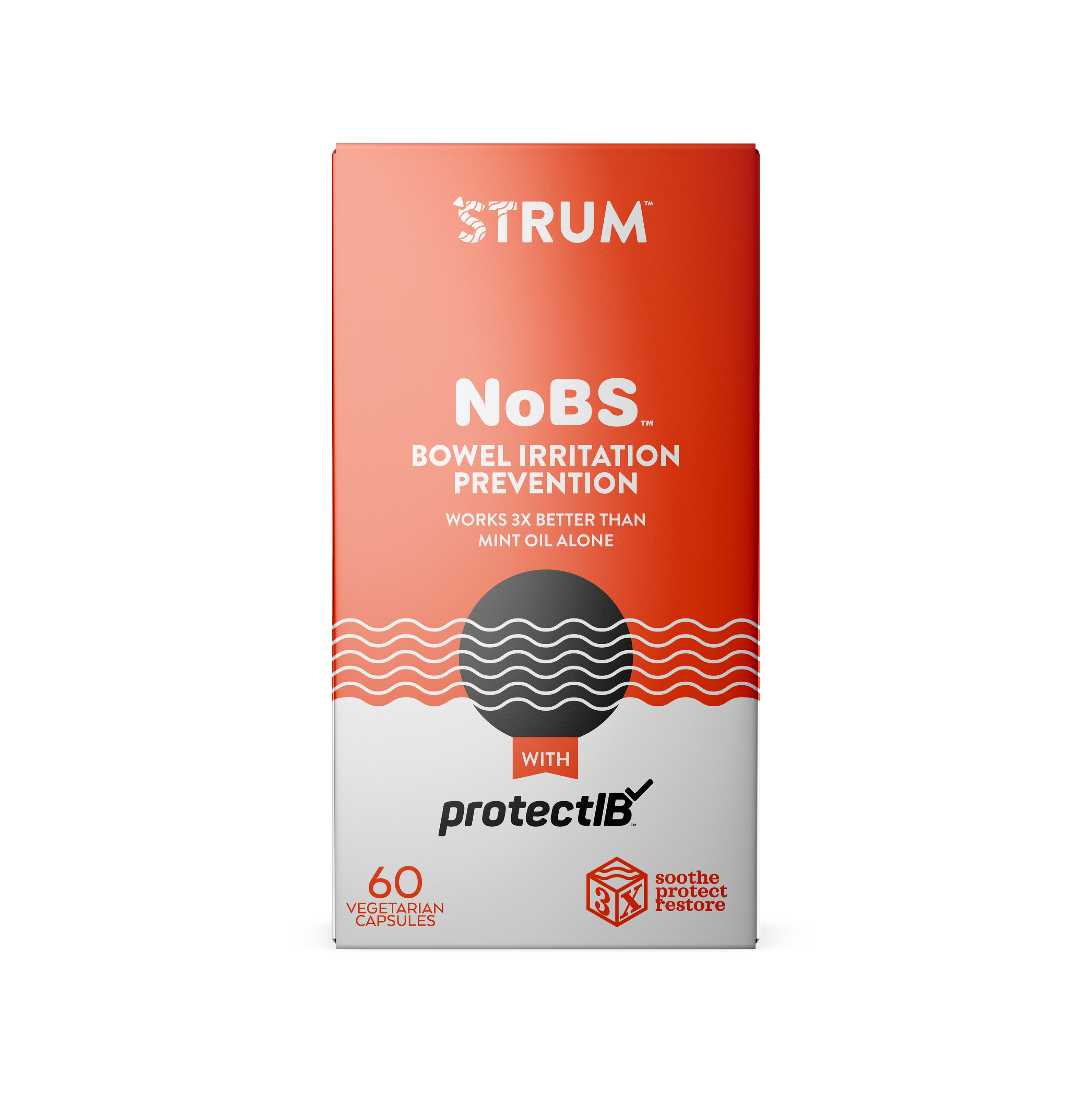
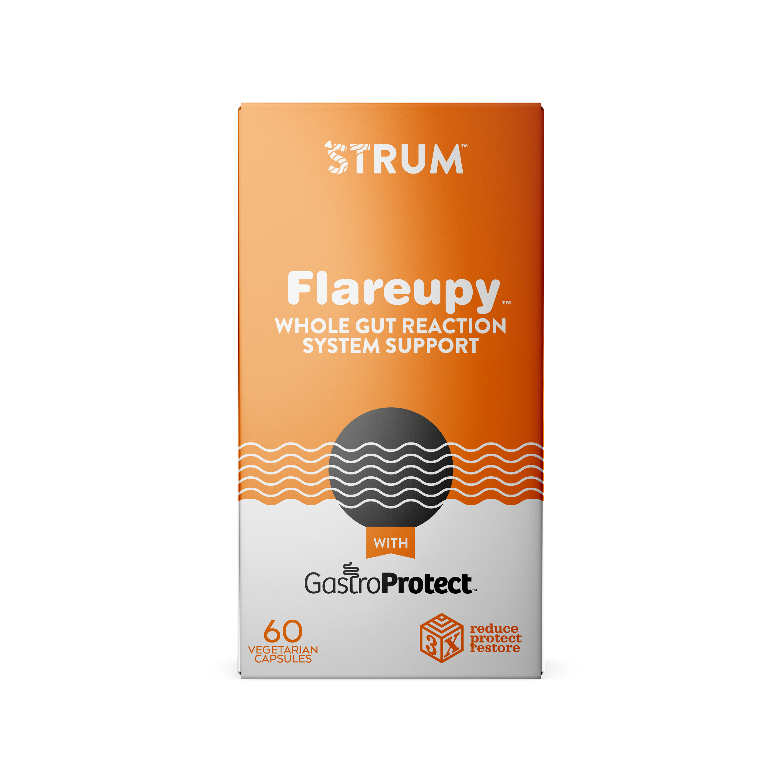
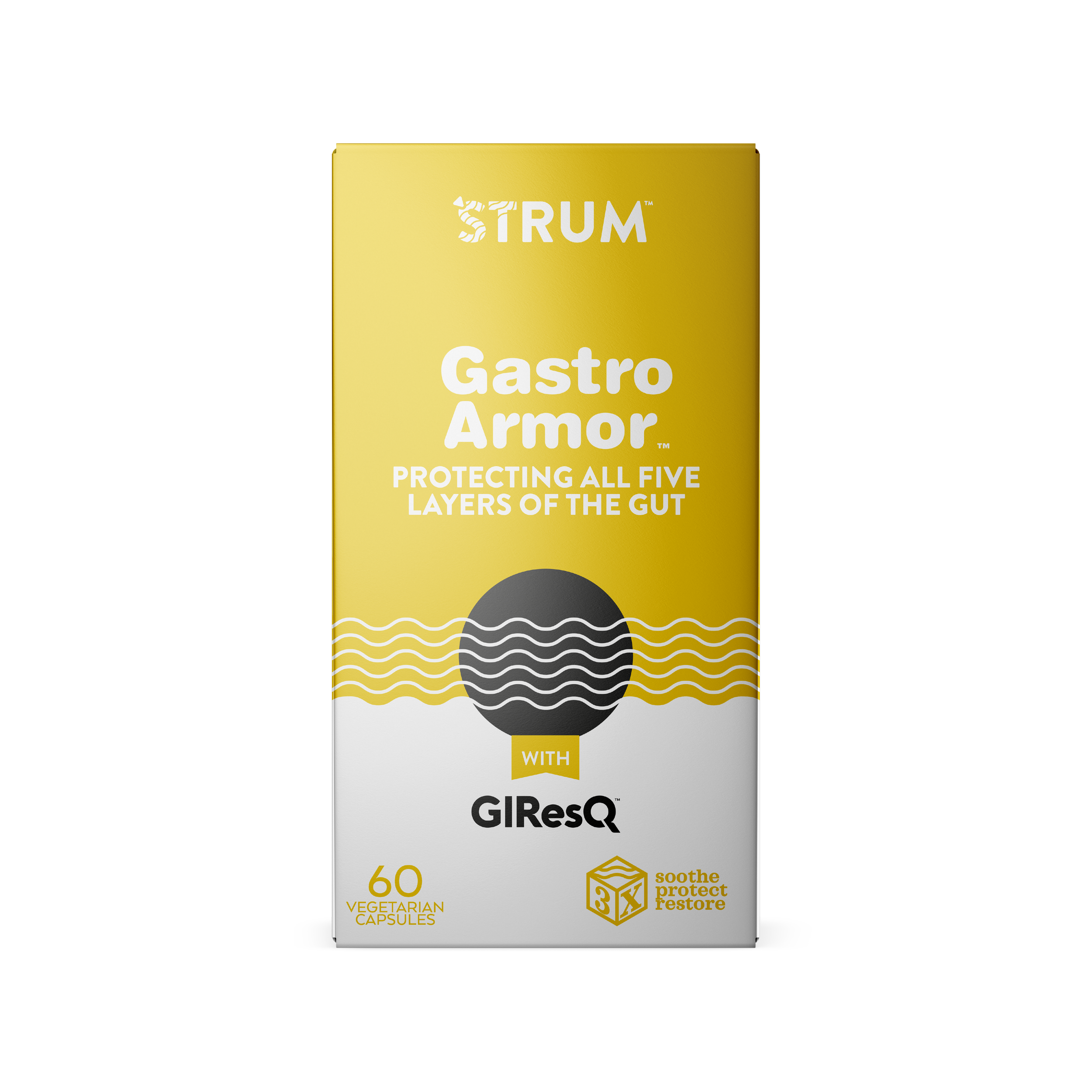
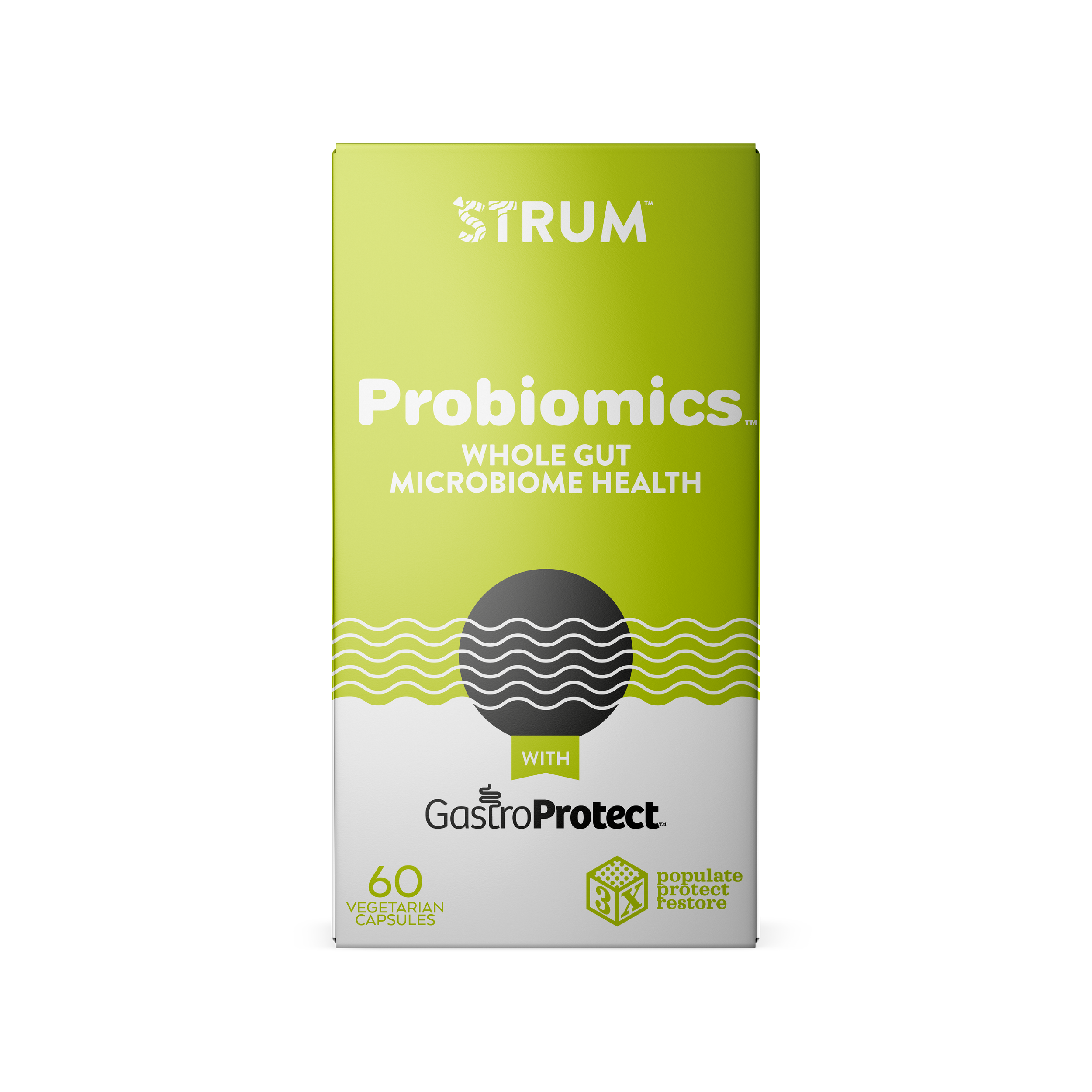
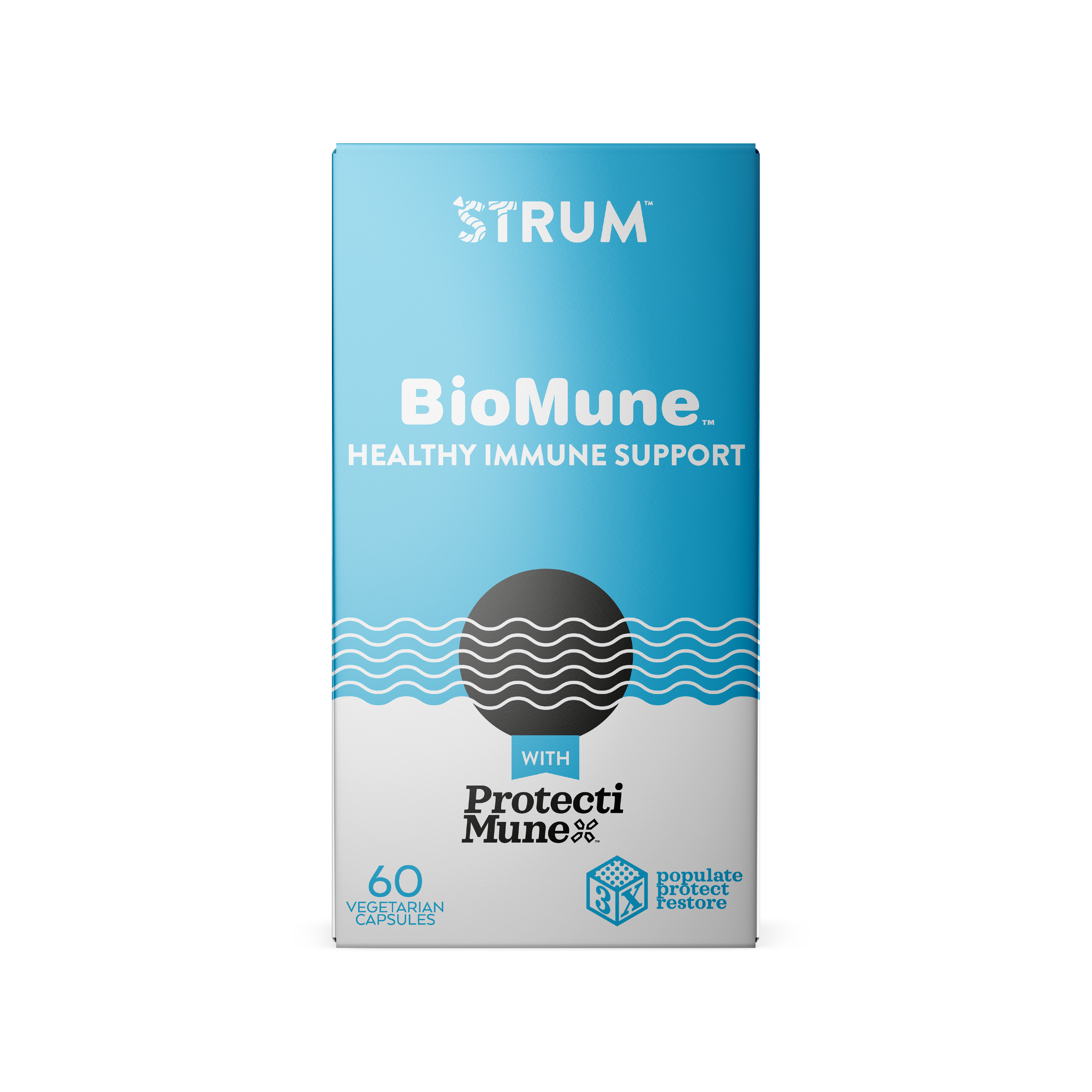
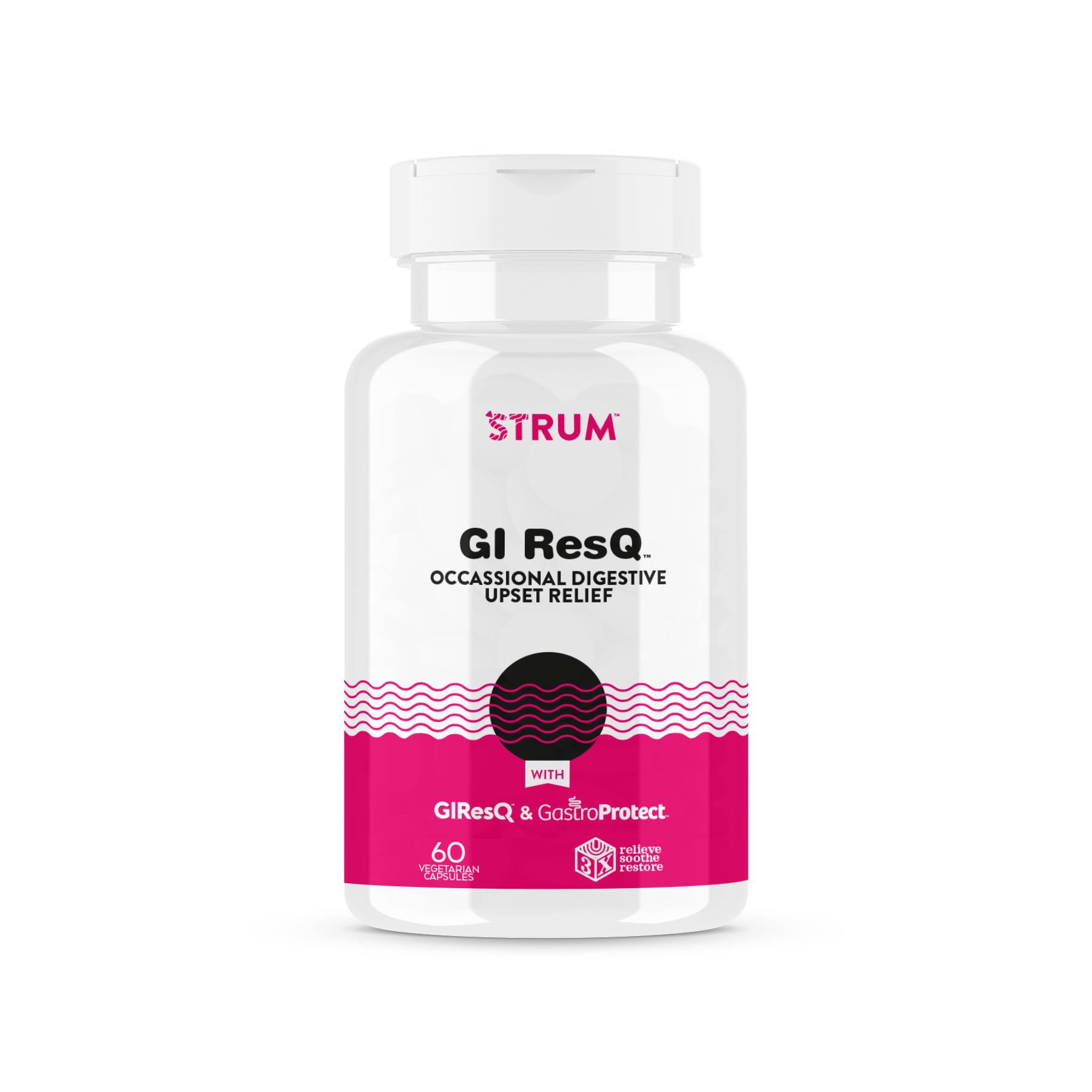
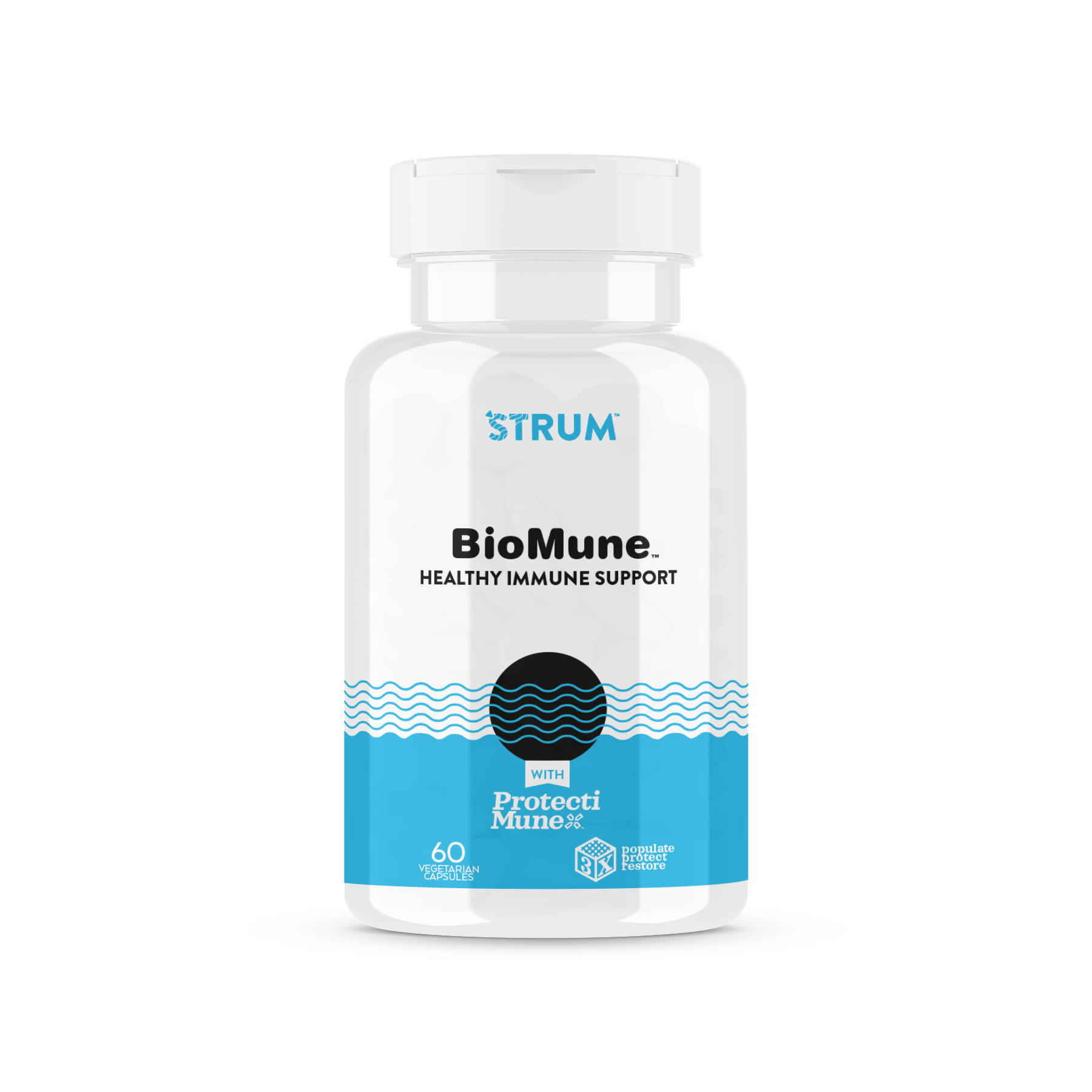
The name came first. Colostrum shortened to ‘Strum, and the wordmark did the rest of the work. The apostrophe became a guitar pick. The letterforms rippled outward from it like reverberating strings, an abstraction that reads two ways at once: sound waves from a strummed chord, and the gut health the product is actually built around.
That double meaning carried through the packaging system. A black circle referenced the sound hole of an acoustic guitar. A rainbow-saturated color palette differentiated the product line and gave the brand shelf presence a category built on beige, clinical packaging rarely had. What could've been a purely clinical supplement line became something with actual personality, without pretending to be something it wasn't.
THE SHARK TANK
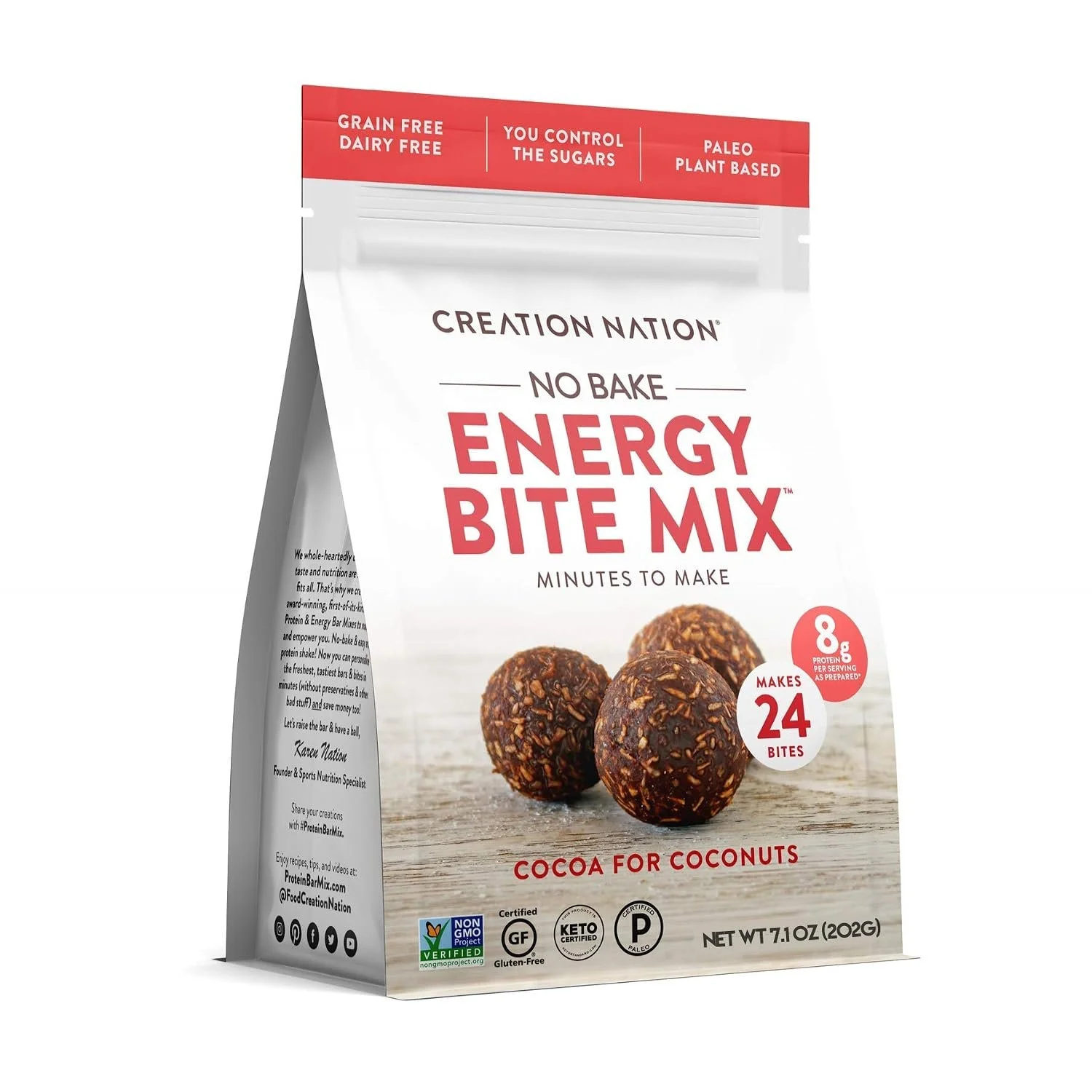
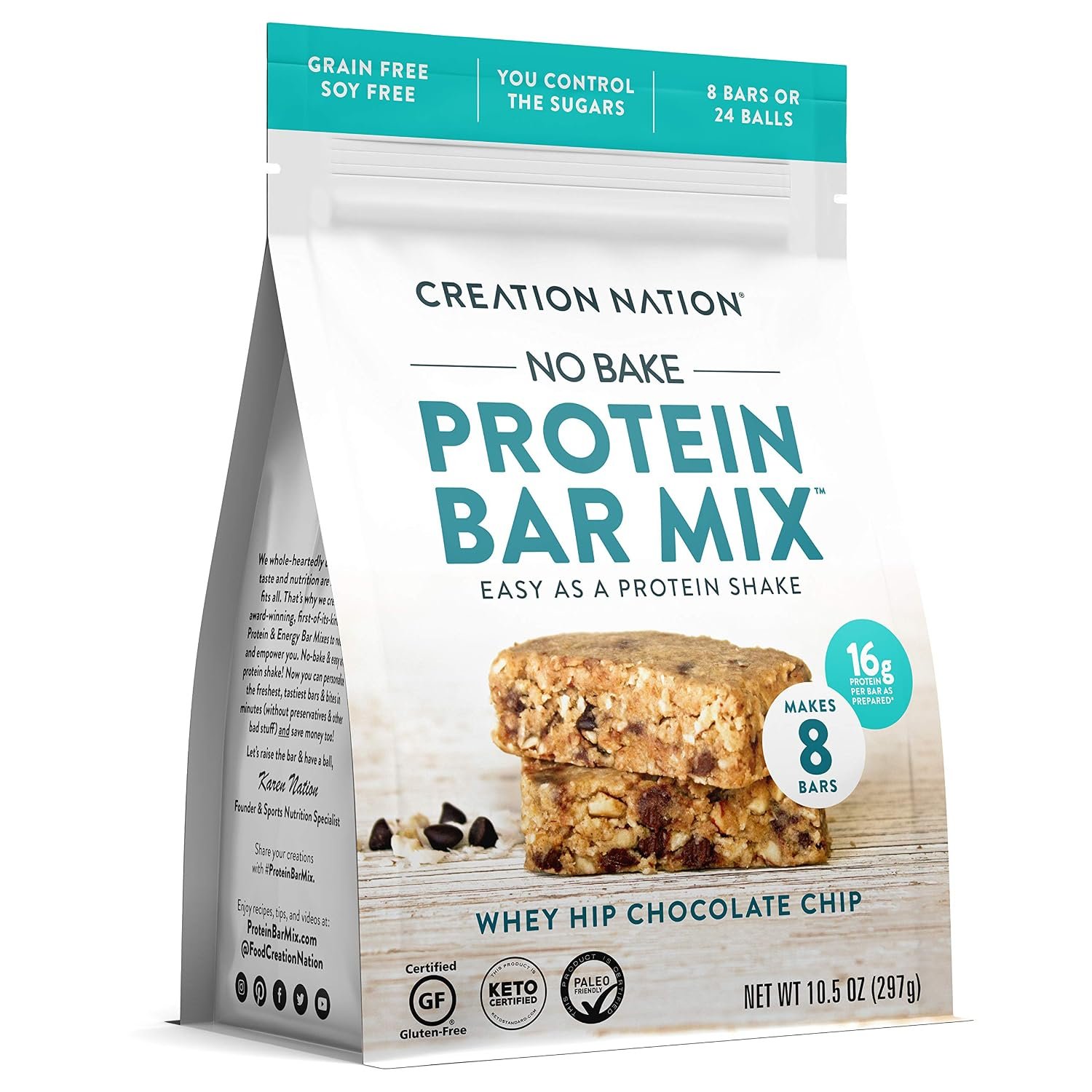
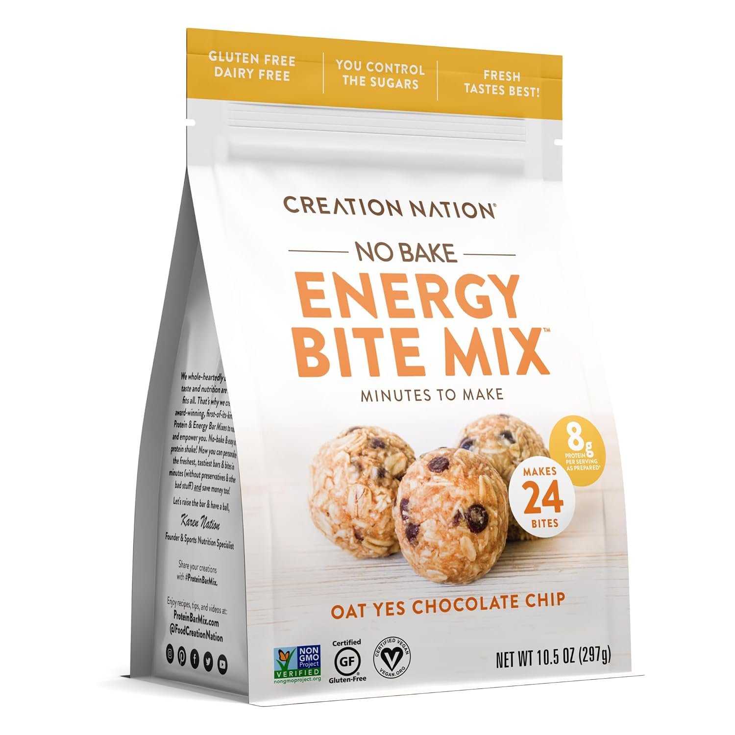
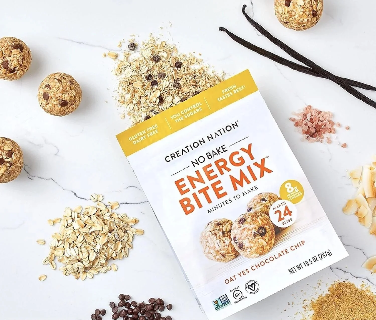
Packaging design for the healthy snack mix brand, done ahead of founder Karen Nation's appearance on Shark Tank. The visual identity helped position the brand for the exposure that followed.